Tag: Geography For Fun And Profit
A Writer’s Window
by Eva Holland | 07.19.12 | 10:45 AM ET
The Paris Review is running a series of blog posts called “Windows on the World”—each one features a writer describing the view from their window, with an accompanying illustration, and so far, Binyavanga Wainaina (of “How to Write About Africa” fame), John Jeremiah Sullivan and other familiar names have joined in. Here’s a bit of Sullivan’s entry, from his home in Wilmington, N.C.:
This is the back view from my office. It’s raining. You can see a wall of the old garage (which still has a deep oil pit inside, from when more people worked on their own cars). The magnolia that hangs over the backyard is blooming. When it does, we open the door to the sleeping porch upstairs, and the whole house fills with the smell.
(Via The Rumpus)
 del.icio.us
 Digg
Digg Facebook
 Furl
Furl Ma.gnolia
 Mixx
Mixx Reddit
 StumbleUpon
 Yahoo! Buzz
Mapped: The Complete Travels of ‘The Simpsons’
by Eva Holland | 02.24.12 | 12:00 PM ET
Slate has a clickable map, marked up by season and character.
Over 23 seasons, 499 episodes, and one feature-length movie, the Simpsons have become one of America’s most well-traveled families. Since the show debuted in 1989, they’ve travelled to more than two dozen countries and about two dozen U.S. states. By the end of the season, they will have travelled to all seven continents. The Simpsons are going to Antarctica!
Call me biased, but I always loved the episode where the Simpsons travel to Canada—and are joined on the bus to Toronto by a hockey player, a Mountie and a Sasquatch.
The Paris Review: ‘Sin Entered the Map’
by Eva Holland | 10.10.11 | 7:04 AM ET
In The Paris Review, Avi Steinberg considers the messy complications of Google Street View—a map that shows us so much more than lines on a grid. Money quote:
A person seeking directions to Starbucks generally does not want to be told to “take a left at the homeless child.” To truly use the country as its own map, it turns out, involves weaving discomfiting images of the country directly into the fabric of the map. The result is not a tidy diagram of the world abstracted onto a blank slab—as nearly all maps since Mesopotamia have been—but rather a patchwork that chronicles, among many other things, the troubling process by which the map was composed.
(Via Andrew Sullivan)
From Mandalay to Timbuktu: Great Names, Lousy Places
by Jim Benning | 06.09.11 | 12:31 PM ET
In an excerpt from his new book, “The Tao of Travel,” Paul Theroux recalls a number of places that just didn’t live up to the romance evoked by their names:
Mandalay: an enormous grid of dusty streets occupied by dispirited and oppressed Burmese, and policed by a military tyranny.
Tahiti: a mildewed island of surly colonials, exasperated French soldiers and indignant natives, with overpriced hotels, one of the world’s worst traffic problems and undrinkable water.
Timbuktu: dust, hideous hotels, unreliable transport, freeloaders, pestering people, garbage heaps everywhere, poisonous food.
I was always drawn to Kuala Lumpur because of its name. I loved just saying the words, and I loved the way they sounded. I loved the way they evoked lumpy koala bears, or something even more exotic that I couldn’t even begin to imagine.
When I finally went there, I was initially underwhelmed. The Petronas Towers are impressive, but they’re not lumpy koala bears. After exploring the city for a couple of days, however, getting lost in Indian neighborhoods with sari shops and aromatic cafes, and even spending a couple of hours in an elegant old theater watching a Bollywood movie I couldn’t understand, I decided Kuala Lumpur had its lumpy charms.
Ever gone to a place that didn’t live up to its great name? Or that did?
Happy 200th Birthday to the Manhattan Grid
by Eva Holland | 03.22.11 | 12:33 PM ET
On March 22, 1811, city officials in New York certified a proposed grid plan of 11 north-south avenues and 155 east-west streets—the building blocks of modern Manhattan. Here’s the New York Times on the impact of the plan:
The grid was the great leveler. By shifting millions of cubic yards of earth and rock, it carved out modest but equal flat lots (mostly 25 by 100 feet) available for purchase. And if it fostered what de Tocqueville viewed as relentless monotony, its coordinates also enabled drivers and pedestrians to figure out where they stood, physically and metaphorically.
“This is the purpose of New York’s geometry,” wrote Roland Barthes, the 20th-century French philosopher. “That each individual should be poetically the owner of the capital of the world.”
I agree: The grid has always made me fearless as a tourist exploring New York City. I never feel lost for more than half a block—regaining my bearings is as easy as walking to the nearest intersection.
The Times also has an interactive map of the original plan laid over today’s city streets. (Via @douglasmack)
Mapped: The World’s Biggest Populations, Re-arranged
by Eva Holland | 11.29.10 | 12:06 PM ET
Here’s a fascinating re-imagining of the world map, in which the countries with the world’s largest populations also occupy the spots on the map with the largest territory. So China takes over Russia’s spot, India moves into Canada’s current location, and so on.
Interestingly, only the United States (with both the third largest population and the third largest area) and Brazil (which lands at number five on both lists) remain in place—every other country gets relocated.
Nine of the World’s Oldest Maps, in Photos
by Eva Holland | 11.16.10 | 12:35 PM ET
Over at the Matador Network, World Hum contributor Lola Akinmade puts together a photo essay of some seriously vintage maps—from ancient Babylon to the Ming Dynasty.
Mapped: Sexual Harassment in Cairo
by Eva Holland | 11.12.10 | 11:31 AM ET
And speaking of street harassment—a group of women’s rights activists in Cairo has created a new site aimed at raising awareness of the problem in their city. The project, HarassMap, uses crowd-sourced emails and text messages to map harassment on the streets—divided into categories like “catcalls,” “touching,” “stalking or following” and “indecent exposure.” The second step? Approaching community leaders in harassment “hotspots” and enlisting their help in combating the problem.
Mapped: Google Maps’ Legal Challenges
by Eva Holland | 10.28.10 | 1:06 PM ET
Gawker has posted a Google map mash-up of all the areas where Google Maps is being investigated over privacy concerns. As one commenter notes: “This sh*t just got meta.”
Mapped: America’s Cities, in Typeface
by Eva Holland | 10.14.10 | 2:24 PM ET
A Texan cartography firm is mapping urban America—using only varying sizes and colors of typeface. Co.Design has samples from the Boston and Chicago maps.
Blogger Suzanna LaBarre notes that they’re “a thoroughly intuitive way to visualize cities. People navigate a new place according to names, not symbols and grids.” New York, San Francisco and Washington, D.C., are next on the firm’s to-do list.
(Via The Daily Dish)
Atlas Unveiled as ‘World’s Biggest Book’
by Michael Yessis | 10.06.10 | 12:24 PM ET
Australian publisher Gordon Cheers debuted a six-by-nine-foot atlas at the Frankfurt Book Fair. He’s pretty cocky about it, too. From the AFP:
“It’s all about creating a legacy,” the Sydney-based publisher said. “Today, everything is digital and it’s gone in a second. This will still be around in 500 years.”
The book took around a month to produce and Cheers is limiting the print run of his monster Atlas to 31. He has already sold two volumes to museums in the United Arab Emirates and is confident he will sell the whole lot.
But is it really the world’s biggest book? As of this post, Wikipedia disagrees!
The Case for Analog Travel Directions
by Michael Yessis | 08.27.10 | 1:44 PM ET
Giving directions is an art form, one we’re losing in the age of GPS and Google Maps. Renée Loth makes the argument:
In this season of vacation travel, I would like to issue a plea for a return to analog directions. This isn’t just a matter of technophobia. Writing good directions is not unlike poetry: an exercise in awareness, requiring an eye for detail and succinct but evocative language. It’s a delight to read something like “Travel over the old stone bridge—built in 1764!—until you see the brick library and Odd Fellows Hall on your right. Turn right there and go down the hill to the water.” Isn’t that so much better than “Head NW on S Main St/MA 1A N .5 miles toward Market Street,” or some similar digital version?
If you care enough and pay attention, you can learn a lot about people by the way they give directions. Are they nostalgic, mentioning phantom buildings or parks that were razed decades earlier? Are they crabbed and secretive, refusing to let you in on the shortcut? Landmarks give meaning to our surroundings, and everyone will emphasize a different place. One woman’s salt marsh is another man’s soccer field.
The All Coast U.S.A. Map
by Michael Yessis | 08.25.10 | 8:21 AM ET
Craig Robinson’s all coast map of the U.S. eliminates the borders with Mexico and Canada. The country looks a bit like a turkey leg. Clever and disorienting.
Google Maps—Minus the Map
by Michael Yessis | 08.23.10 | 11:29 AM ET
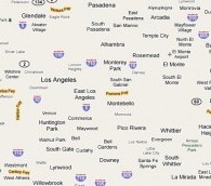
Yet another interesting way to look at the world or, in this case, Los Angeles. (Via Kottke)
‘The Agnostic Cartographer’: Google Maps and Geopolitics
by Eva Holland | 07.26.10 | 5:21 PM ET
Washington Monthly takes a look at the latest geopolitical kerfuffle touched off by the web giant. This time around, it’s a disputed area on the India-Tibet border that suddenly appeared on Google Maps “sprinkled with Mandarin characters, like a virtual annex of the People’s Republic.” The Indian blogosphere was not amused.
Here’s writer John Gravois on why the nature of Google Maps makes it particularly prone to these sorts of international incidents:
Rather than produce one definitive map of the world, Google offers multiple interpretations of the earth’s geography. Sometimes, this takes the form of customized maps that cater to the beliefs of one nation or another. More often, though, Google is simply an agnostic cartographer—a peddler of “place browsers” that contain a multitude of views instead of univocal, authoritative, traditional maps. “We work to provide as much discoverable information as possible so that users can make their own judgments about geopolitical disputes,” writes Robert Boorstin, the director of Google’s public policy team.
Ironically, it is that very approach to mapping, one that is indecisive rather than domineering, that has embroiled Google in some of the globe’s hottest geopolitical conflicts. Thanks to the logic of its software and business interests, Google has inadvertently waded into disputes from Israel to Cambodia to Iran. It is said that every map is a political statement. But Google, by trying to subvert that truth, may just be intensifying the politics even more.
‘‘Remote’ is a Word We Like to Misuse’
by Eva Holland | 07.15.10 | 9:49 AM ET
Dave Weigel is blogging this week from an island way out in the Aleutians. Here’s his introduction to Dutch Harbor, Alaska:
There is usually some diversity of companions on an airplane. Not on this one. The men have beards and gear and heavy boots; the women have all but one of these things. Your fellow travelers look like they’re heading to the same bar after work, possibly because they are. Another thing you notice is that most of them have shirts or jackets with “Alaska” written on them. This seems odd—you don’t head into Newark and bump into travelers with “New Jersey” jackets. Then you realize you’re being foolish, and that almost everyone you’re flying with works for some Alaska company, in construction or fishing or research, and that they’re wearing the raincoats they’ve been handed for free.
Mapped: The Places Your Travel Dollars Will Take You
by Eva Holland | 06.15.10 | 9:40 AM ET
Kayak has unveiled a pretty cool new Google maps-powered feature, Explore. Enter a price range and departure city—plus a few optional bonus fields, like your preferred temperature at destination—and Explore generates a map of all the places you can fly to on the budget you’ve specified. $550 dollars from my home in Whitehorse to San Francisco? Tempting, Kayak. Very tempting. (Via Kottke)
The 100 Most Celebrated Travel Books of All Time: Mapped
by World Hum | 06.15.10 | 8:49 AM ET
Browse our map mash-up to see where the journeys for the most celebrated travel books take place
Mapped: Photos by Locals vs. Photos by Tourists
by Michael Yessis | 06.09.10 | 9:51 AM ET
A very cool set of maps on Flickr harnesses geotagging in an attempt to show which parts of cities tend to be photographed by tourists, and which areas of cities tend to be photographed by locals. The maps I looked at aren’t particularly surprising—in the San Francisco Bay Area, for instance, tourists can’t get enough of the Golden Gate Bridge (tourist shots are red in the image below), and they hardly ever photograph the East Bay (locals’ shots are in blue).
Nevertheless, it’s a simple, compelling way to share the information, and perhaps, as Jeff Pflueger mentioned in one of his travel photography columns, the kind of thing we can expect to see more of as travelers geotag their images. (Via The Morning News)
How to Make A Globe of Your Hometown
by Michael Yessis | 06.07.10 | 2:25 PM ET
Or state. Or country. Or whatever. Apparently localized globes were popular in the countries of the former USSR post-independence. English Russia remembers the phenomenon, and explains how to make a localized globe with a map and a photoshop plugin. This might be cooler than the Map Envelope. (Via Utne Reader)
- « Prev Page
- Next Page »